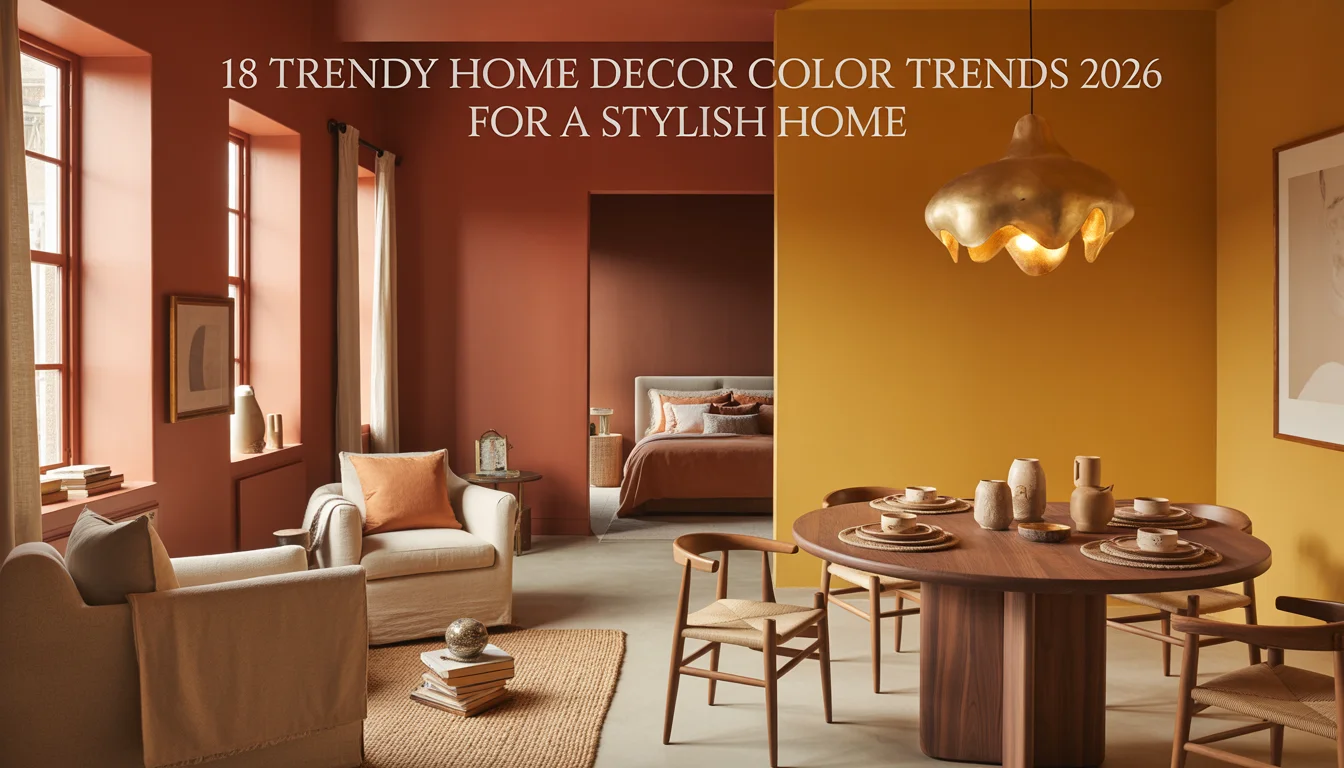
18 Trendy Home Decor Color Trends 2026 for a Stylish Home
Color has a way of setting the entire mood of a home, from a cozy terracotta living room to a soft sage green kitchen. This year’s palette leans warm, earthy, and a little unexpected, moving away from stark neutrals toward colors that feel rich and lived in.
Whether you are ready to paint a whole wall or just want to layer in a few new pieces, these eighteen color trends bring real personality to every room in an American home.
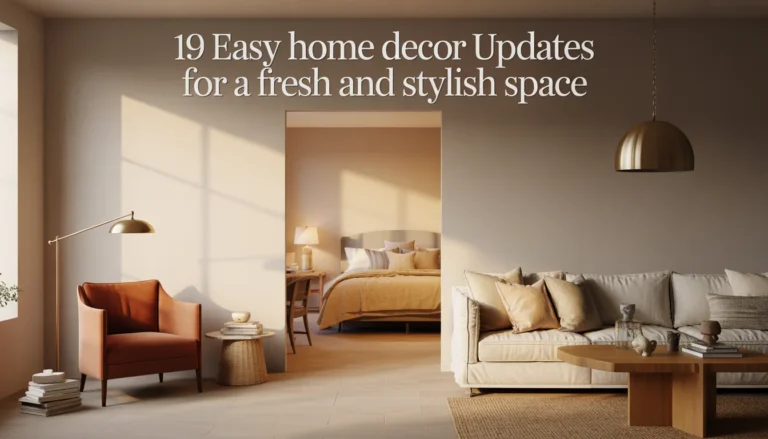
1. Warm Terracotta Living Room
Terracotta is having a real moment in 2026, and a living room is the perfect place to embrace it. A pair of terracotta linen armchairs anchor the seating area, paired with a neutral bouclé sofa so the warm color feels intentional rather than overwhelming. A jute rug in a natural weave ties the earthy palette together underfoot.
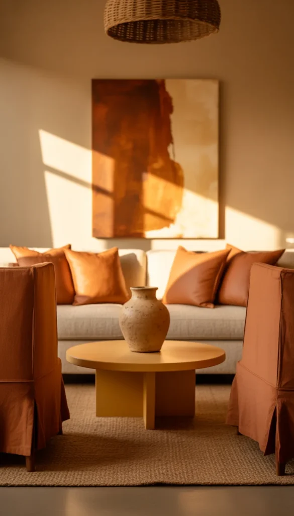
A low wood coffee table holds a ceramic vase in a matching clay tone, while a rattan pendant light overhead adds texture without competing with the color story. A large abstract canvas in warm rust and cream hangs above the sofa, and a woven basket beside the armchairs holds extra throws. The room feels sun warmed even on a gray day.
Color Palette
- Warm Terracotta: #C1653D
- Natural Rattan: #C9A66B
- Soft Cream: #F2EDE3
- Clay Brown: #8A5A3C
2. Muted Sage Green Kitchen
Sage green continues to soften kitchens in the most beautiful way in 2026. Shaker style cabinets in a muted sage cover the lower half of the kitchen, paired with warm white countertops and brushed brass hardware for a touch of shine. Open wood shelving above holds simple stoneware in cream and soft green tones.
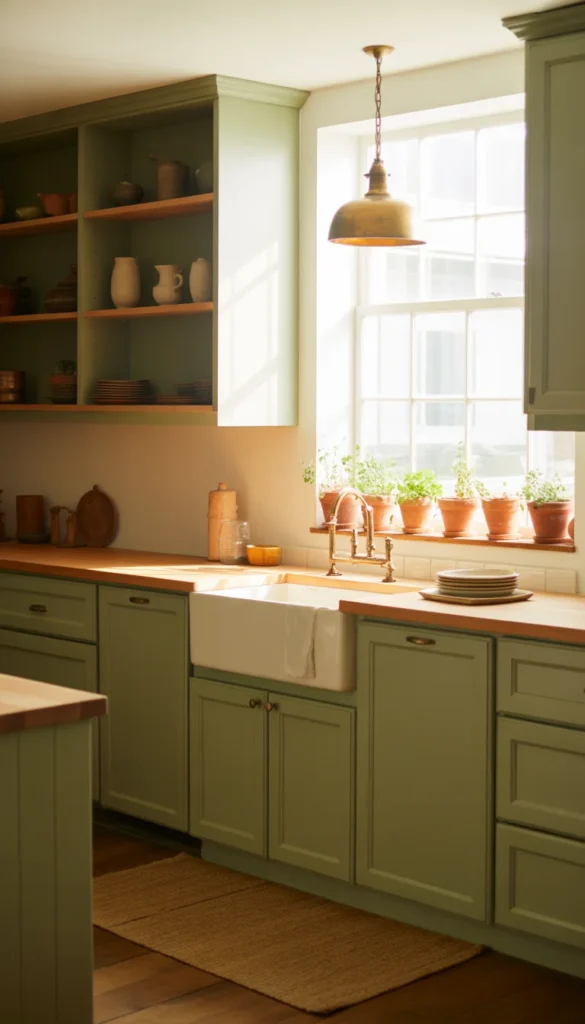
A woven runner in a natural jute weave lines the floor in front of the sink, while a small herb garden in terracotta pots sits on the windowsill. A vintage pendant light with an aged brass finish hangs above the island, and linen tea towels in a coordinating sage stripe hang from the oven handle. The whole kitchen feels calm and a little bit like a garden.
Color Palette
- Muted Sage Green: #8FA07E
- Warm White: #F6F2EA
- Aged Brass: #A47B4D
- Natural Oak: #C9A876
3. Deep Chocolate Brown Primary Bedroom
Chocolate brown has replaced stark black as the moody color of choice for bedrooms this year. A wall behind the bed painted in a deep, warm chocolate creates an instantly cocooning feeling, paired with an upholstered bouclé bed frame in soft cream. A camel colored throw folded at the foot of the bed adds warmth without adding contrast.
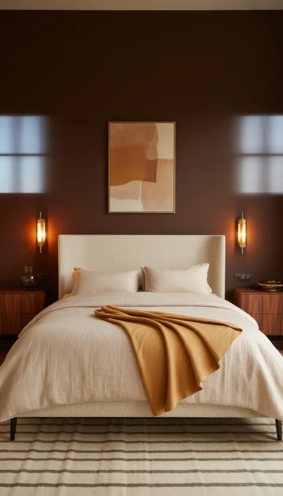
Brass wall sconces above simple walnut nightstands keep the surfaces clear while still providing warm light, and a low wool rug in a subtle striped pattern grounds the bed. A single piece of abstract art in warm neutral tones hangs above the headboard, and a woven basket in the corner holds extra pillows. The room feels rich, warm, and enveloping.
Color Palette
- Deep Chocolate Brown: #4A3327
- Warm Cream: #F0E9DB
- Camel Tan: #B8946A
- Aged Brass: #A47B4D
4. Buttery Yellow Breakfast Nook
Soft, buttery yellow is bringing warmth back into kitchens and breakfast nooks in 2026 without feeling overly bright or trendy. A built in banquette gets a fresh cushion in a soft buttercream fabric, paired with a round wood table and two simple bentwood chairs. A woven pendant light hangs low above the table for warm morning light.
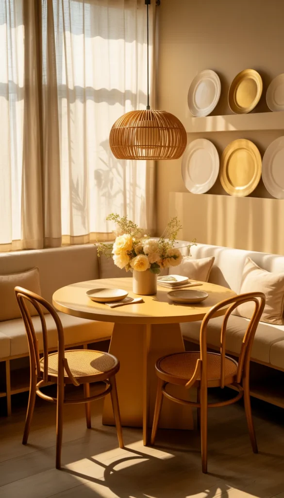
Café curtains in a soft cream cover the lower half of the nearby window, letting light filter in gently, while a small vase of fresh flowers sits at the center of the table. A narrow shelf above the banquette holds a few vintage plates in cream and soft yellow tones. The whole nook feels like the sunniest, happiest corner of the house.
Color Palette
- Buttery Yellow: #E9CE8A
- Soft Cream: #F7F3EA
- Sage Green: #8FA07E
- Warm Wood Brown: #8A6A4A
5. Dusty Blue Powder Bathroom
Dusty blue is a gentle, sophisticated choice for a powder bathroom this year, calm enough to feel restful but rich enough to still make a statement. Grasscloth wallpaper in a soft dusty blue wraps the walls, paired with a simple white pedestal sink and a brushed nickel faucet for a cool, understated finish.
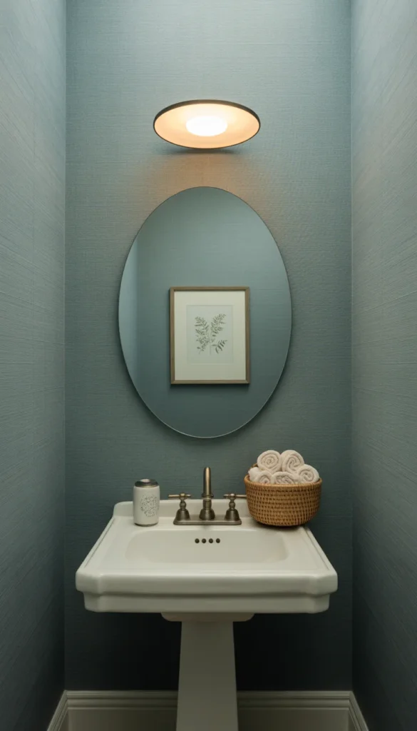
A round mirror with a thin black frame keeps the reflection simple, while a single sconce above provides soft, even light. A small woven basket holds rolled hand towels on the narrow counter, and a framed botanical print adds a touch of green against the blue wallpaper. The room feels quiet, fresh, and a little unexpected.
Color Palette
- Dusty Blue: #7C93A3
- Soft White: #F3F0E9
- Matte Black: #262624
- Sage Green Accent: #8FA07E
6. Rich Burgundy Formal Dining Room
Burgundy is bringing back a sense of drama and warmth to formal dining rooms in 2026. A deep burgundy paint covers all four walls, creating an intimate, jewel toned backdrop for a long wood table with turned legs. Upholstered dining chairs in a soft cream fabric keep the room from feeling too heavy.
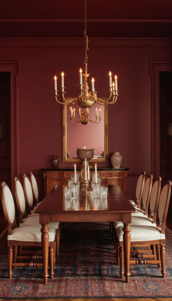
A brass and glass chandelier hangs above the table, casting a warm glow across the burgundy walls each evening, while a large gilt framed mirror on one wall reflects the light back into the room. A wood sideboard holds a collection of ceramics and glassware, and a thick wool rug beneath the table adds softness underfoot. The room feels special and a little bit indulgent.
Color Palette
- Rich Burgundy: #6B2A32
- Warm Cream: #F2EBDD
- Warm Brass: #B08D57
- Espresso Brown: #3B2A22
7. Warm Clay Pink Guest Bedroom
Clay pink, warmer and more grounded than a traditional blush, is showing up in guest bedrooms everywhere this year. A wall behind the bed gets a soft coat of clay pink paint, paired with a simple white painted bed frame dressed in crisp linen bedding and one terracotta colored throw pillow for contrast.
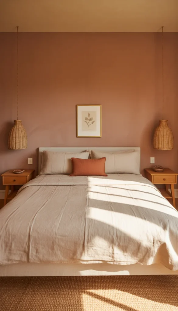
Rattan pendant lights hang on either side of the bed instead of traditional lamps, saving space on the simple wood nightstands below. A woven jute rug covers the floor, and a small framed botanical print hangs above the bed. A single potted plant in the corner softens the warm, welcoming palette. Guests always seem to sleep especially well in this room.
Color Palette
- Warm Clay Pink: #C48A7A
- Soft White: #F5F1EA
- Terracotta Accent: #B9704B
- Natural Rattan: #C9A66B
8. Olive Green Home Office
Olive green is proving to be one of the most versatile trend colors of the year, and it works beautifully in a home office. A wall behind the desk gets painted in a rich olive tone, paired with a simple wood desk and a rattan desk chair for natural texture. Open shelving beside the desk holds books and a few small plants.
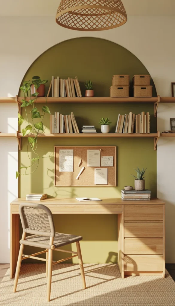
A woven pendant shade filters natural light into soft patterns across the olive wall, while a low jute rug defines the workspace within a larger room. A cork board holds notes and inspiration clippings, and a stack of woven storage boxes keeps papers tidy without looking clinical. The room feels focused, grounded, and quietly stylish.
Color Palette
- Olive Green: #6B7A4F
- Warm Cream: #F2EDE1
- Natural Rattan: #C9A66B
- Terracotta Accent: #B9704B
9. Soft Ivory and Oat Studio Living Room
For a small studio apartment, this year’s trend leans into a soft, tonal palette of ivory and oat rather than bold color. A low profile sofa in warm oat fabric sits on a pale wool rug, paired with a single round wood coffee table. The palette stays intentionally quiet so the small space feels open and calm.
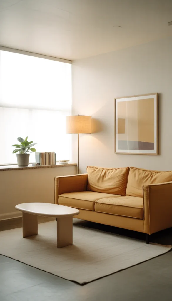
A slim floor lamp with a linen shade provides soft ambient light, while a single framed print in warm neutral tones hangs above the sofa. A narrow shelf nearby holds a small, curated stack of books and one plant. Every piece here earns its spot in a room where there simply is not space for anything extra.
Color Palette
- Soft Ivory: #F5F1E8
- Warm Oat: #DCD0BC
- Light Ash Wood: #C9B896
- Soft Taupe: #B8A78E
10. Espresso Brown Accent Entryway
Espresso brown is replacing black as the grounding neutral of choice for entryways this year. A slim console table in a rich espresso wood finish holds a shallow brass tray for keys, while a row of matching wall hooks above handles coats and bags. A woven bench beneath offers a spot to sit while removing shoes.
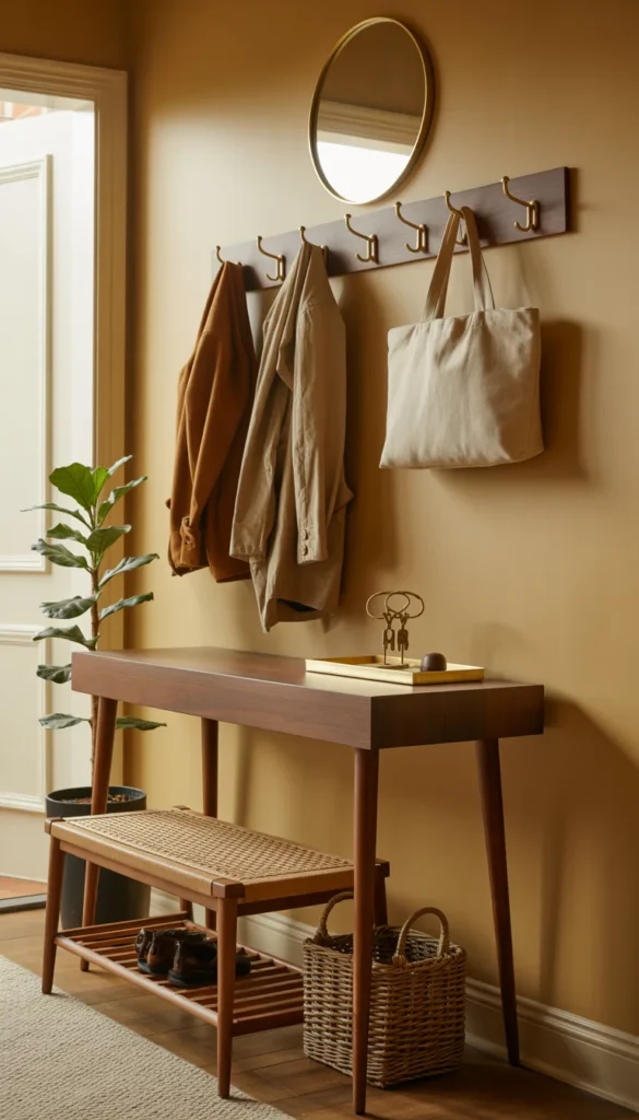
A round mirror with a thin brass frame hangs above the console, bouncing light back into the space, and a tall potted plant in the corner softens the deep wood tones. A woven basket beneath the bench keeps shoes tucked out of sight. The entryway feels grounded and welcoming from the very first step inside.
Color Palette
- Espresso Brown: #3B2A1F
- Warm Brass: #B08D57
- Soft White: #F6F2EA
- Sage Green Accent: #8FA07E
11. Warm Rust Orange Sunroom
Rust orange is warming up sunrooms this year in a way that feels earthy rather than loud. Wicker armchairs get fresh cushions in a warm rust tone, paired with a low driftwood coffee table and a natural jute rug. Sheer linen curtains at the windows soften the sunlight without blocking the view.
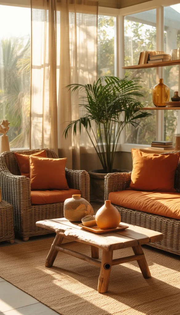
A large potted palm in the corner brings the outdoors in, while a scattering of ceramic pieces in warm clay tones sits on the coffee table. Open shelving along one wall holds a few ceramic vases and a stack of well loved books. The whole room feels sun warmed and a little bit nostalgic, like a favorite vacation spot.
Color Palette
- Warm Rust Orange: #B9622F
- Sandy White: #F1EAD8
- Natural Rattan: #C9A66B
- Sage Green Accent: #8FA07E
12. Muted Lavender Reading Nook
Muted, dusty lavender is a surprisingly grown up trend color this year, especially in a quiet reading corner. A slightly worn armchair upholstered in soft lavender sits beneath a window, paired with a low wood side table just big enough for a mug and a stack of books. A chunky cream throw drapes over the arm of the chair.
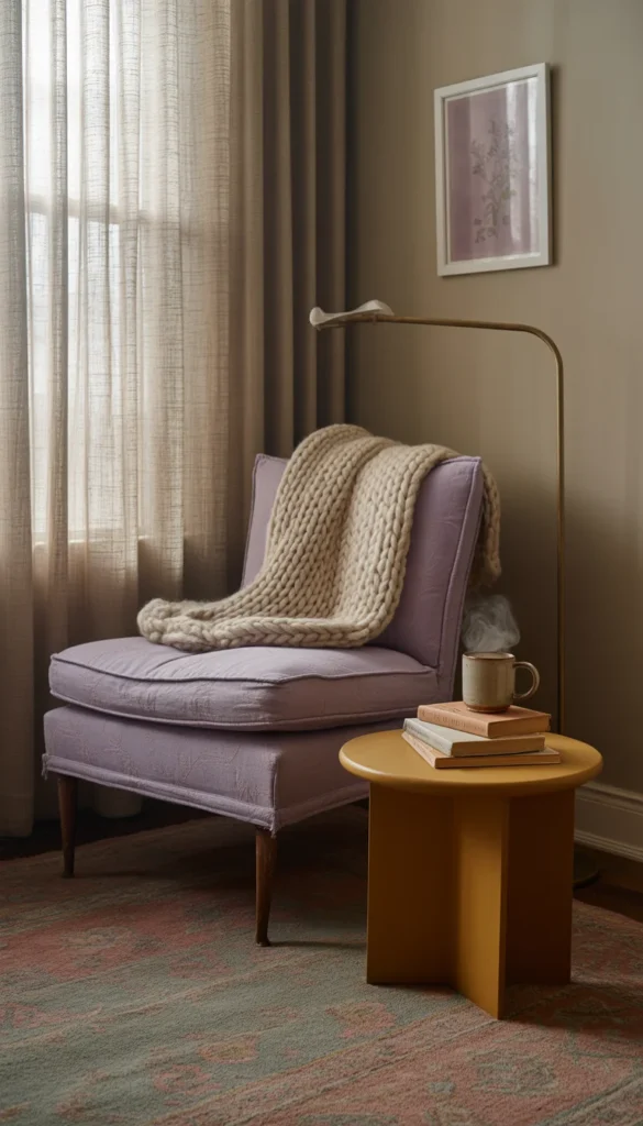
A brass floor lamp with a linen shade provides warm reading light, while a small vintage rug in muted purple and cream tones grounds the corner. A woven basket beside the chair holds extra blankets, and a single framed print in soft plum tones hangs nearby. The corner feels calm, a little dreamy, and easy to sink into.
Color Palette
- Muted Lavender: #A895A6
- Warm Cream: #F2EDE1
- Aged Brass: #A47B4D
- Soft Plum Accent: #6E4A5C
13. Charcoal and Warm White Industrial Loft
Charcoal paired with warm white is giving industrial lofts a softer, more livable edge this year. Exposed brick along one wall stays untouched, while the opposite wall gets a fresh coat of charcoal paint to ground the open space. A warm white bouclé sofa sits on a low pile charcoal rug, paired with a black metal and wood coffee table.
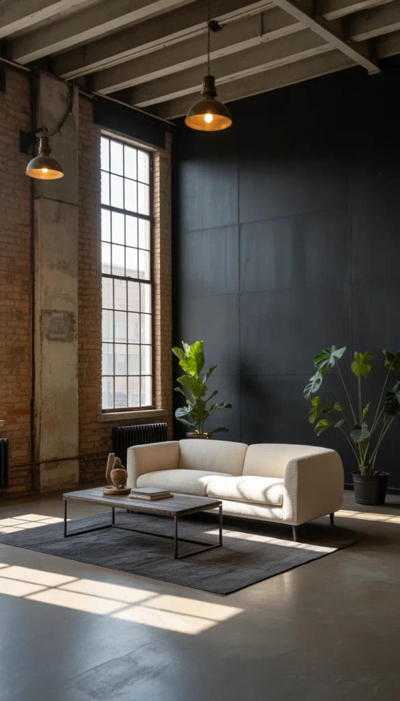
Aged bronze pendant lights hang from visible ceiling beams, and a large factory style window lets in plenty of natural light. A vintage metal locker adds unexpected storage, while a few oversized potted plants soften all the hard surfaces. The mix of dark and light keeps the loft feeling warm rather than cold.
Color Palette
- Charcoal Gray: #3A3936
- Warm White: #F4F1EA
- Exposed Brick Red: #9C5A45
- Aged Bronze: #7A5A3A
14. Warm Almond Neutral Kids Bedroom
Warm almond is a fresh alternative to stark white for a kids bedroom this year, soft enough to feel calming but warm enough to avoid feeling cold or clinical. Walls painted in a gentle almond tone form the backdrop for a simple wood bed frame dressed in soft cream bedding with one mustard throw pillow for a playful touch.
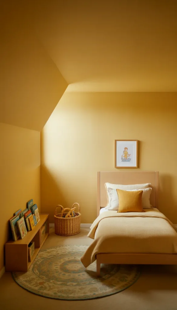
A round rug in a soft, muted pattern defines the play area, while a low bookshelf displays picture books facing outward. A woven basket holds toys within easy reach, and a single framed print of a simple, cheerful illustration hangs above the bed. The room feels warm, gentle, and ready to grow with a child over the years.
Color Palette
- Warm Almond: #D9C6A5
- Soft Cream: #F6F2E8
- Golden Mustard Accent: #C99B3E
- Dusty Blue Accent: #7C93A3
15. Deep Teal Home Library
Deep teal is bringing a rich, jewel toned mood to home libraries and reading rooms this year. Floor to ceiling wood shelving stands out beautifully against a wall painted in deep teal, filled with a well loved book collection mixed with a few ceramic pieces and framed prints. A deep leather armchair sits angled toward the shelves.
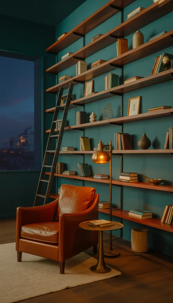
A small round side table holds a brass floor lamp for warm, focused reading light, while a low wool rug in muted cream tones softens the floor. A rolling library ladder, if ceilings allow, adds old world charm. The room feels rich, cozy, and a little bit like stepping into a favorite novel.
Color Palette
- Deep Teal: #1F4A47
- Cognac Leather: #8A4A2C
- Warm Brass: #A47B4D
- Cream Ivory: #F2EBDD
16. Golden Ochre Dining Nook
Golden ochre is warming up small dining nooks this year with a sunny, grounded energy. A wall behind the table gets painted in a rich ochre tone, paired with a round wood table and a mix of wood and rattan chairs. A woven runner in warm neutral tones lines the floor beneath.
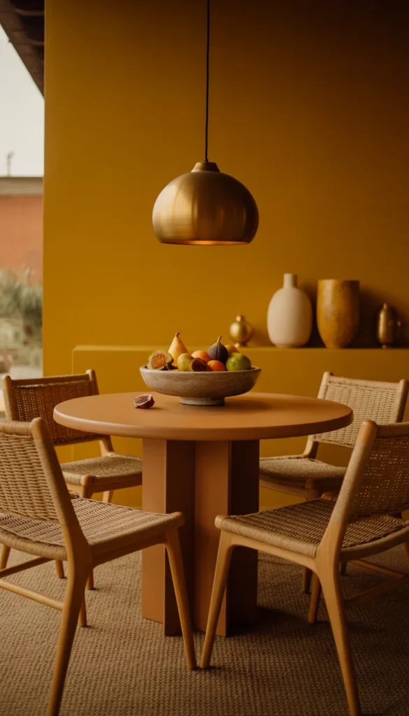
A brass pendant light hangs low above the table, casting a warm glow that plays beautifully off the ochre wall, and a stoneware bowl filled with seasonal fruit sits at the center of the table. A narrow shelf nearby holds a small collection of ceramics in cream and warm gold tones. The nook feels cheerful and welcoming for everyday meals.
Color Palette
- Golden Ochre: #C08A3E
- Warm Cream: #F3EEE1
- Natural Rattan: #C9A66B
- Espresso Brown Accent: #3B2A22
17. Soft Plum Powder Bathroom
Soft plum is a beautifully unexpected choice for a powder bathroom this year, rich without feeling overly dark. Walls painted in a soft, dusty plum wrap the small space, paired with a simple white pedestal sink and a brushed brass faucet for warmth. A round mirror with a thin brass frame hangs above.
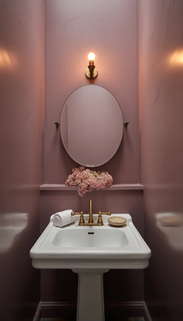
A single sconce provides soft, flattering light, while a small dish on the sink edge holds a rolled hand towel and a bar of soap. A narrow ledge beneath the mirror holds one small vase of fresh flowers in a coordinating soft pink. Because the room is glimpsed rather than lived in daily, it can afford to feel a little romantic.
Color Palette
- Soft Plum: #6E4A5C
- Soft White: #F5F1EA
- Warm Brass: #B08D57
- Dusty Rose Accent: #C98F86
18. Warm Cognac and Cream Family Room
Warm cognac leather paired with soft cream fabric is giving family rooms a collected, timeless feel this year. A deep cognac leather sofa anchors the seating area, paired with two cream upholstered accent chairs for softness and contrast. A large woven rug in warm neutral tones ties the mixed materials together.
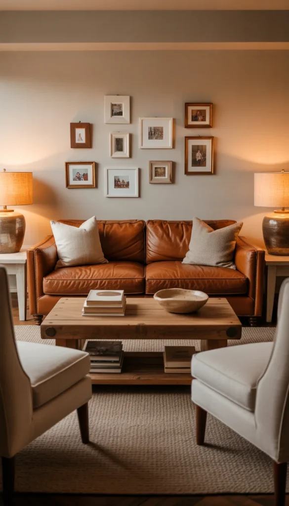
A reclaimed wood coffee table holds a stack of coffee table books and a simple ceramic bowl, while linen shade table lamps on side tables provide warm evening light. A gallery of small framed family photos fills one wall in a relaxed, slightly asymmetrical arrangement. The room feels warm, welcoming, and built for real family life.
Color Palette
- Cognac Leather: #8A4A2C
- Soft Cream: #F2EDE1
- Warm Walnut Brown: #6B4A34
- Sage Green Accent: #8FA07E
Quick Styling Tips
- Layer at least two different textures in every room, like a smooth linen sofa against a chunky wool rug, so a trend color feels warm and touchable rather than flat.
- Choose fabrics that can genuinely handle daily life, especially when you are working a bold trend color into a living room or kitchen.
- Mix furniture materials on purpose, pairing wood with metal or rattan with leather, so a strong color palette still feels layered and collected.
- Combine one or two vintage or secondhand pieces with newer furniture, since that contrast keeps a trendy color from feeling too matched or showroom like.
- Light a room from three different heights, a floor lamp, a table lamp, and an overhead fixture, so rich trend colors like burgundy or teal still feel warm at night.
- Anchor your main seating with a rug large enough for the front legs of your furniture to sit on, so the whole color story feels grounded rather than floating.
- Let a single trend color lead the room instead of using several bold colors at once, then let artwork and accessories bring in supporting tones.
Shopping Guide
| Item | Budget Pick | Luxury Pick |
| Accent Chair | Upholstered slipper chair in trend color | Leather or bouclé designer armchair |
| Area Rug | Flatweave cotton area rug | Hand knotted wool area rug |
| Table Lamp | Ceramic table lamp with linen shade | Handblown glass table lamp |
| Throw Pillows | Cotton canvas throw pillow set | Belgian linen down filled pillows |
| Paint | Sample size trend color paint pot | Premium designer paint line |
Conclusion
A trendy home does not need a full renovation or a professional designer to feel current and beautifully styled. Sometimes it just takes one accent wall, a new set of pillows, or a single piece of furniture in this year’s favorite color to completely shift how a room feels. Color is one of the easiest and most personal ways to update a home.You do not have to commit to every trend at once. Pick one color from this list, maybe the terracotta living room or the deep teal library, and start there this weekend. Save this article for later and come back whenever your next room is ready for a refresh.