
How to Add Character to a Builder-Grade Home?
A builder-grade home is efficient, affordable and predictable, which is useful until the rooms start to feel plain. The same white walls, flat trim, hollow doors and standard light fittings repeat from room to room, so nothing in the house feels chosen. Adding character does not require a full remodel or an endless budget. With thoughtful edits to architecture, surfaces, lighting and styling, a cookie-cutter home can become a place that feels curated, comfortable and personal.
The work goes in phases, and the order matters. Start by deciding on a style direction and a budget, then work from the outside in: the entry, the walls and trim, the surfaces, the lighting, the floors, the small fixtures, and finally the furniture and personal details. Each phase builds on the last, so a painted front door, a taller baseboard or a better light fitting can change how the next change reads.
Assess Your Home and Define Your Style
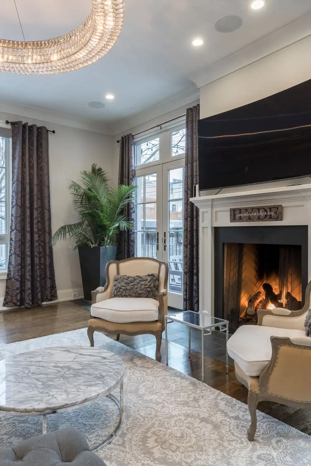
Photo Credit: @alex-qian-1180283
Before changing anything, walk through every room and note what is working and what reads as builder-grade. Strong bones might include an open floor plan, large windows or a fireplace. Weaknesses often include flat ceilings, hollow doors, thin trim, boxy windows and generic lighting. Make a simple two-column list, keep and enhance on one side, fix or hide on the other, and let that list become the plan.
Character depends on a coherent style direction. There is no need to commit to one historic period, but choosing a direction — modern farmhouse, transitional, mid-century, Craftsman or relaxed coastal — keeps every later decision consistent. Collect three to five images that capture the feeling wanted, and note the recurring details in them: trim profiles, door styles, stair spindles or metal finishes. Those recurring cues become cheap guides for making different rooms read as one home.
Set Priorities, Budget and Timeline
Not every change carries the same impact, so rank projects by return. Paint, hardware and light fixtures often give immediate, visible results. Trim packages, flooring and built-ins last longer but cost more. A useful order is three phases: Phase 1, high impact and low disruption, covering paint, hardware and light fixtures; Phase 2, medium impact and moderate disruption, covering trim, flooring and built-ins; Phase 3, major changes such as window swaps or structural alterations. Assign a ballpark budget and a timeline to each phase, even if the numbers are rough, because a staged plan prevents overspending and lets character build gradually.
Boost Curb Appeal and Make the Entry Welcoming

Photo Credit: @anshu
The exterior sets expectations before anyone steps inside. Painting the front door a bold accent colour is inexpensive and shifts the whole mood of the house. Replacing or painting shutters, updating the mailbox and house numbers to match the chosen finish, and adding window boxes with seasonal planting all soften a bland facade. A little landscaping — mulch, a couple of structural shrubs and pathway lighting — can make even a modest yard feel intentional.
Inside, the entry is the first interior impression. A statement light fitting over the entry sets the tone, and a small console, a mirror and purposeful hooks or a bench create instant hospitality. Defining the entry with contrasting paint or a different flooring material, such as a tile inset, tells visitors they have arrived somewhere curated. Architectural details help too: simple trim around windows and doors creates shadow and depth, tapered columns or decorative brackets add Craftsman cues to a porch, and a modest roof overhang above the entry adds proportion and shelter.
Add Character Through Trim, Millwork and Built-Ins

Photo Credit: @tima-miroshnichenko
Trim has outsized influence for the cost. Replacing flimsy stock trim with taller baseboards, layered casing and a thoughtful profile adds depth and age to a room. Baseboards of four to six inches suit most rooms, taller in rooms with nine-foot ceilings, and a multi-piece casing for doors and windows reads far more finished than thin single-piece stock. Trim paint should be crisp and slightly glossy to read as intentional, and even swapping door hardware to solid knobs or levers reinforces the upgraded look.
Crown moulding and ceiling treatments change perceived ceiling height and scale. Options range from simple crown to coffered ceilings or beadboard panels, and a modest ceiling medallion around a light can feel charming without costing much. Paneling, from full-height wainscoting to board-and-batten, adds character to hallways and dining rooms, anchors furniture arrangements and protects walls in high-traffic areas. Built-ins are both practical and distinctive: window seats with storage turn a shallow nook into a destination, shelving flanking a fireplace creates intentional focus and display space, and a built-in desk or mudroom cubbies in the entry maximise function while reading as custom. Painted built-ins in a coordinating accent colour read as built in rather than bought.
Transform Surfaces With Paint, Wallpaper and Finishes
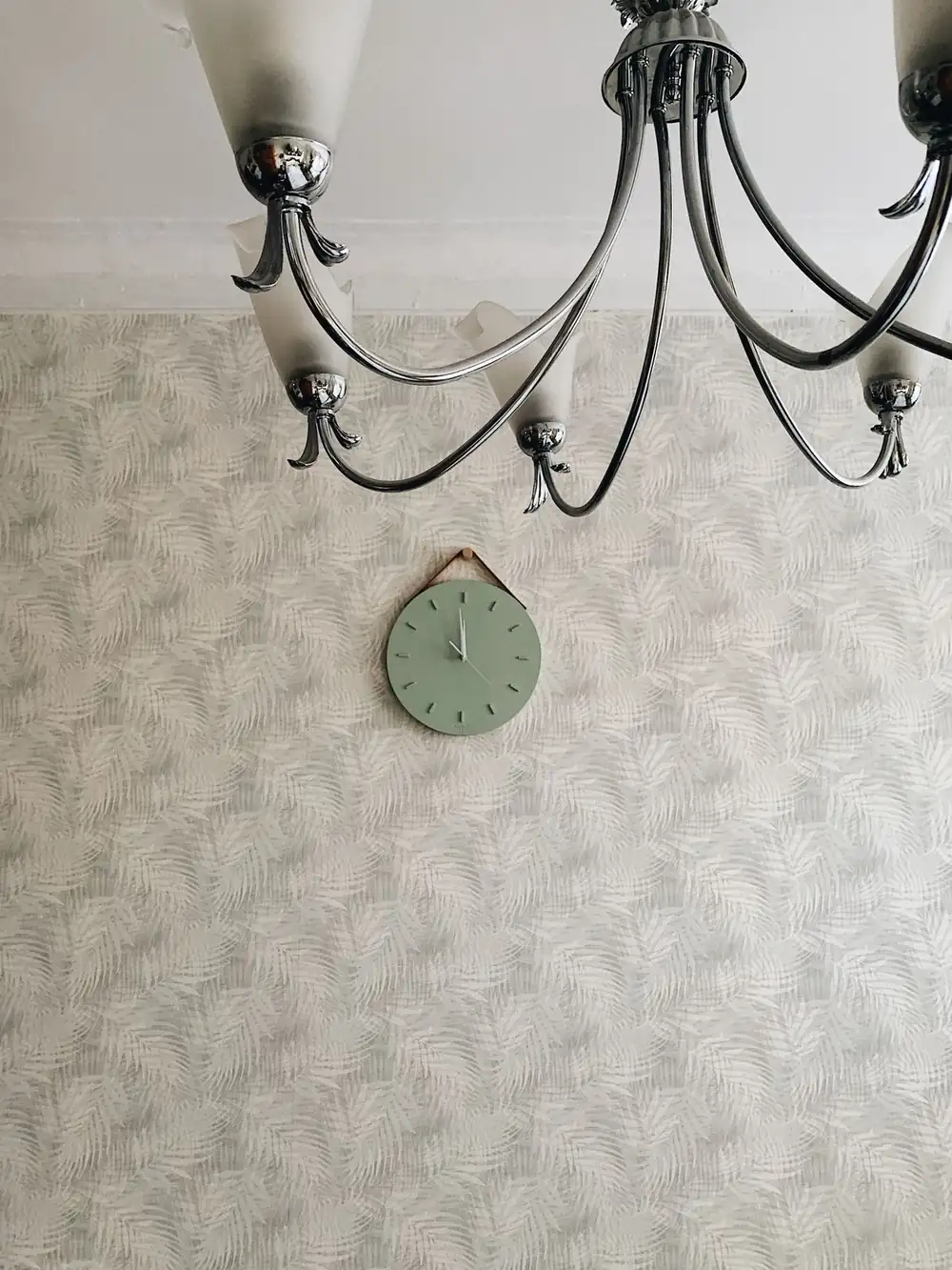
Photo Credit: @mary-nikitina-53440096
Paint is the most democratic way to add character. Think in layers: base wall colour, trim colour and accent hues. Warm, slightly muted tones make rooms feel lived in rather than staged, and painting trim a different, complementary colour instead of matching it to the walls adds depth. Darker tones on ceilings in cosy rooms create intimacy, while pale ceilings make spaces feel airier. Test swatches large enough to read in different light and live with them for several days, because a colour that reads warm in the afternoon might look cold at dusk. Colour alone can change a whole room, as the paint ideas in Bathroom Paint Colors show in a small space.
Accent walls still work when used with purpose. Instead of painting a single wall the loudest colour in the room, choose walls where architecture or furniture will sit against them. Wainscoting or board-and-batten on the lower third of a wall gives classic proportion, Venetian or lime plaster in muted tones adds subtle sheen and texture in a powder room or entry, and a fireplace surround finished in a contrasting material becomes the room’s focal point. Wallpaper has made a comeback, but restraint is the trick: bold patterns suit smaller or secondary spaces such as powder rooms, closets, behind bookcases or an accent bedroom wall. Textured finishes like grasscloth add tactile warmth but can be pricier and need professional installation, so testing removable wallpaper first is a low-risk way to try pattern. Pattern scale matters: small rooms tolerate smaller prints, while large rooms can handle large-scale motifs.
Upgrade Lighting to Add Warmth and Character
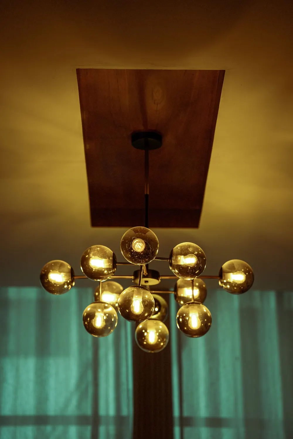
Photo Credit: @melbinjacob
Good lighting changes mood and reveals material quality, so design it in layers. Ambient lighting from ceiling fixtures or recessed cans provides general light, task lighting from under-cabinet lights, bedside lamps or desk lighting serves daily work, and accent lighting from wall sconces, picture lights and LED strips highlights architecture. Dimmers belong wherever possible, because lighting that is too bright or too flat makes spaces feel clinical, while dimmable layers let the atmosphere be tailored for cooking, cleaning and relaxing.
A well-chosen chandelier or pendant can anchor a room and read like jewellery for the house, and the key is scale. For dining tables, a fixture should be roughly one-half to two-thirds the width of the table and hang about 30 to 36 inches above the surface. In entryways, the fixture should balance the ceiling height, and groupings of pendants over kitchen islands should be coordinated in size and finish. Choose fixtures that reflect the chosen style: aged brass for warm traditional looks, matte black for modern contrast, or glass and wood for transitional warmth. Smart bulbs and switches add function without rewiring, but when moving fixtures or adding built-ins with recessed lighting, check wiring capacity, and hire a licensed electrician for new circuits or hardwired fixtures.
Flooring, Rugs and Textures That Ground a Room

Photo Credit: @hamzaurann
Flooring anchors a room. Builder-grade often means basic carpeting or narrow engineered planks, and upgrading to wider-plank hardwood, or realistic high-quality luxury vinyl plank, adds sophistication. Wide-plank wood in warm tones gives continuity and a sense of age, porcelain tile with wood or stone looks suits wet areas, and durable carpets in bedrooms with a low, dense pile and neutral hue last longer. Choose floors with a grain or pattern that masks wear, so character stays intact in busy households.
Rugs bring warmth, colour and acoustic softness, and they define seating areas in open plans. Size matters: living room rugs should sit under all front legs of furniture to unify the seating group. Layering a sisal or jute rug under a softer wool rug adds texture contrast, and runners in hallways add colour and protect flooring. Transitions are often overlooked but reveal age and care: consistent transition strips that match or complement flooring, running the same flooring through main living areas to enlarge the space visually, and deliberate breaks where changes make sense, such as between kitchen tile and living wood, with a threshold stone or metal strip for a tidy edge.
Swap Hardware, Plumbing and Decorative Fixtures

Photo Credit: @matreding
Small finishes tie a home together, so pick a two-to-three finish palette and repeat it across rooms: a primary finish for large fixtures such as door levers and cabinet pulls, a secondary finish for lighting and plumbing, and an accent finish for shelving brackets or stair hardware. Common palettes include warm brass with matte black accents, aged nickel with oil-rubbed bronze, or satin chrome with polished brass accents for eclectic mixes. Consistency in finish elevates perceived quality and reduces visual clutter.
Replacing cabinet pulls, door levers and faucets yields a high return for the cost. Look for solid metal pieces rather than plated low-quality hardware, because weight matters: swapping all cabinet hardware in a single afternoon gives instant cohesion, replacing hollow-core interior door knobs with lever sets feels substantial, and adding backplates to classic knobs gives an intentional vintage touch. In kitchens and baths, a few targeted swaps dramatise results: change a faucet to a modern high-arc model with a pull-down sprayer, add open shelving to display curated dishes or linens, and replace dated vanity hardware and update the mirror with a framed or backlit option. Small changes in the kitchen carry the same logic as the backsplash ideas for kitchens with white cabinets, where one strong surface choice lifts the whole room.
Furnishing, Styling and Personal Details

Photo Credit: @cottonbro
A collected home looks like it evolved, so mix modern, vintage and handmade pieces intentionally rather than buying a matching set. Mix scales, eras and textures: a slim modern sofa beside a vintage wood side table, a new linen curtain beside an old brass lamp, a smooth ceramic vase beside a woven basket. The mix works when one colour or material repeats through the room, so the pieces read as chosen over time rather than gathered at random.
Personal details are what make a house feel like a home. A gallery wall of family photos, travel prints and small art makes a plain hallway or living room personal in a way no bought decor can, and black frames with white mounts give a calm classic look while mixed wood frames feel relaxed. Plants add freshness, colour and life: a tall floor plant, a medium one on a stool and a small one on a table, grouped at different heights, soften hard edges and bring living texture into a room. Keep styling to a few deliberate groups rather than filling every surface, because breathing room around a feature is what lets it be seen. One large piece of art, rather than a cluster of small frames, gives a blank wall a clear focal point, and choosing art about two-thirds the width of the sofa or bed below it keeps the room balanced.
Final Thoughts
Character in a builder-grade home comes from layering, not from replacing everything at once. A clear style direction, a staged budget, and one considered change at a time — a painted front door, taller trim, a warmer light, a better faucet — add up to a home that feels intentional. The strongest rooms share the same habits: one clear focal point per room, a repeated colour or material to tie the layers together, and breathing room around the feature so it can be seen.
Start with the change that bothers the eye most, whether that is the blank wall, the plain door or the bare hallway, and let that one choice set the colours for the next. A home that grows in small, considered layers feels personal because it is, and each phase here is a layer that can stand alone or build on the last.